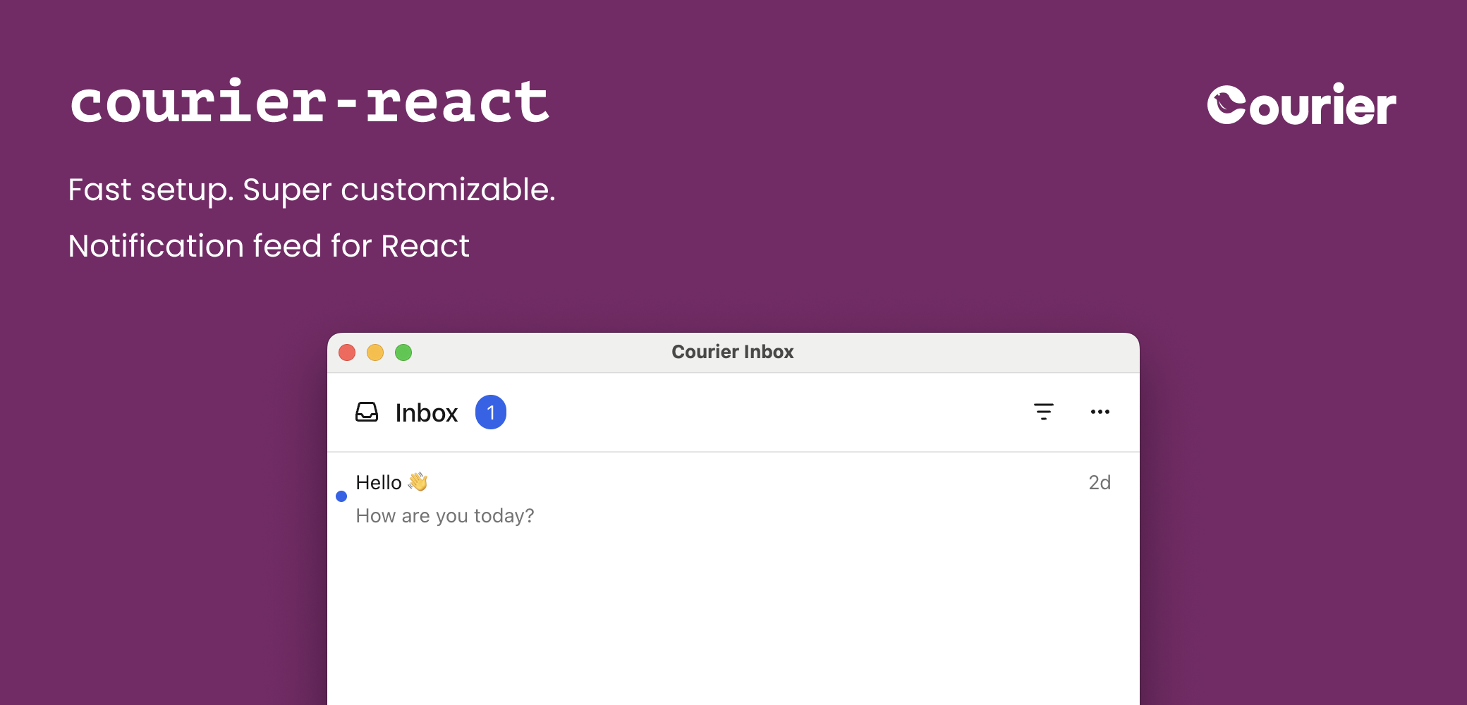
Embed a customizable in-app notification center and toasts in your React app. Courier React components seamlessly integrate with email, SMS, push, and more.
This is the latest version of the Courier React SDK, recommended for new and existing apps.If you’re coming from an earlier version of the Courier React SDK, check out the
v8 migration guide for what’s changed,
how to upgrade your app, and links to documentation for past versions of the React SDK.
Available on
GitHub
and npm.Courier publishes two React packages: @trycourier/courier-react for React 18+ and @trycourier/courier-react-17 for React 17.
To use the SDK, you need to generate a JWT (JSON Web Token) for your user. This JWT should always be generated by your backend server, never in client-side code.
When your app needs to authenticate a user, your client
should make a request to your own backend (ex. GET https://your-awesome-app.com/api/generate-courier-jwt).
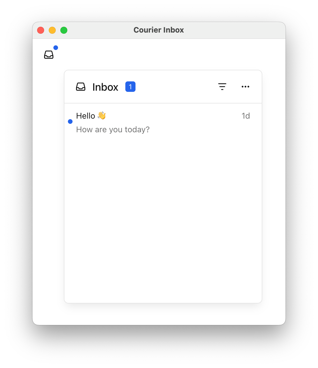
import { useEffect } from "react";import { CourierInbox, useCourier } from "@trycourier/courier-react";export default function App() { const courier = useCourier(); useEffect(() => { // Generate a JWT for your user on your backend server const jwt = "eyJhbGciOiJIUzI1NiIsInR5cCI6IkpXVCJ9..."; // Authenticate the user with the inbox courier.shared.signIn({ userId: $YOUR_USER_ID, jwt: jwt, }); }, []); return <CourierInbox />;}
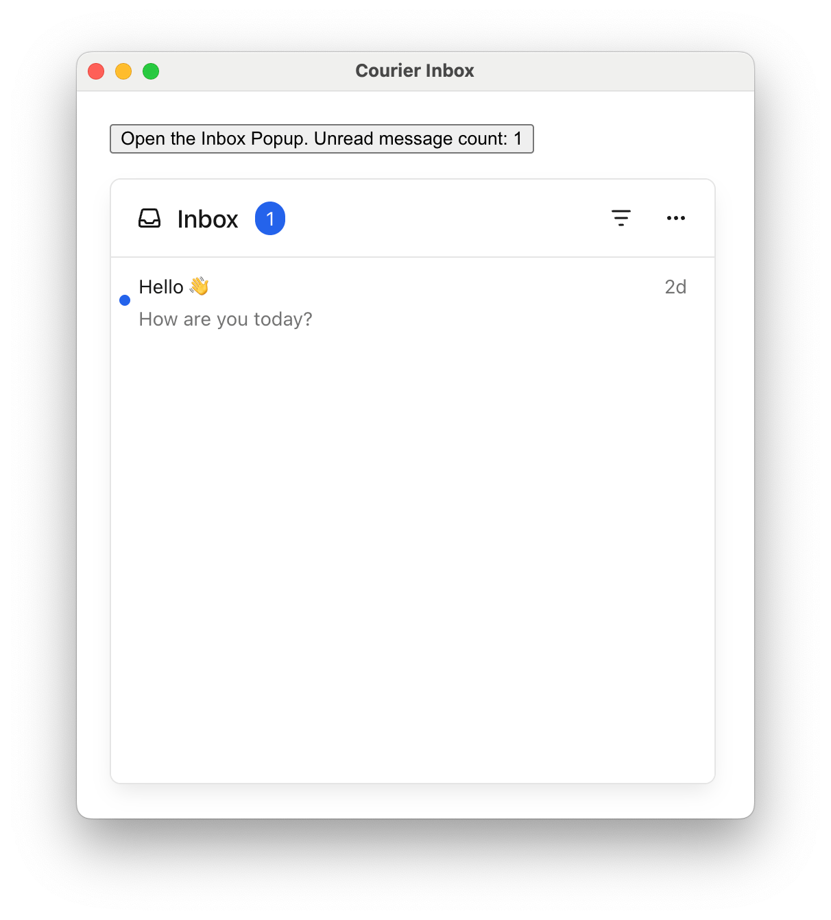
import { useEffect } from "react";import { CourierInbox, useCourier } from "@trycourier/courier-react";export default function App() { const courier = useCourier(); useEffect(() => { // Generate a JWT for your user on your backend server const jwt = "eyJhbGciOiJIUzI1NiIsInR5cCI6IkpXVCJ9..."; // Authenticate the user with the inbox courier.shared.signIn({ userId: $YOUR_USER_ID, jwt: jwt, }); }, []); return ( <div style={{ padding: "24px" }}> <CourierInboxPopupMenu /> </div> );}
Looking for toast notifications? See the Toast Component section below.
onMessageLongPress is only applicable on devices that support touch events.
Copy
Ask AI
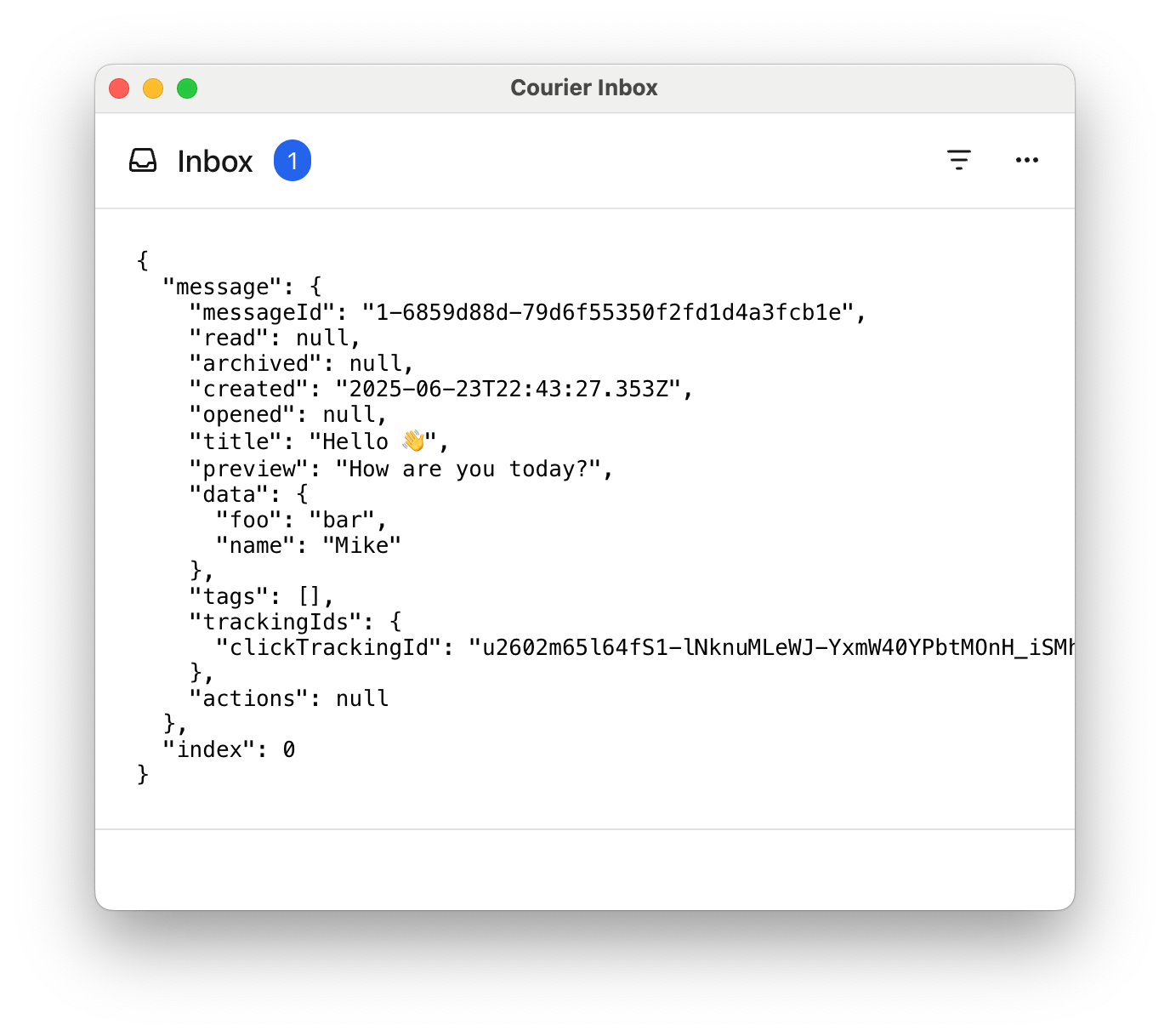
import { useEffect } from "react";import { CourierInbox, useCourier, type CourierInboxListItemFactoryProps, type CourierInboxListItemActionFactoryProps} from "@trycourier/courier-react";export default function App() { const courier = useCourier(); useEffect(() => { // Generate a JWT for your user on your backend server const jwt = "eyJhbGciOiJIUzI1NiIsInR5cCI6IkpXVCJ9..."; // Authenticate the user with the inbox courier.shared.signIn({ userId: $YOUR_USER_ID, jwt: jwt, }); }, []); return ( <CourierInbox onMessageClick={( { message, index }: CourierInboxListItemFactoryProps) => { alert(`Message clicked at index ${index}:\n` + `${JSON.stringify(message, null, 2)}`); }} onMessageActionClick={( { message, action, index }: CourierInboxListItemActionFactoryProps) => { alert(`Message action clicked at index ${index}:\n` + `Action: ${JSON.stringify(action, null, 2)}\n` + `Message: ${JSON.stringify(message, null, 2)}`); }} onMessageLongPress={( { message, index }: CourierInboxListItemFactoryProps) => { alert("Message long pressed at index " + `${index}:\n${JSON.stringify(message, null, 2)}`); }} /> );}
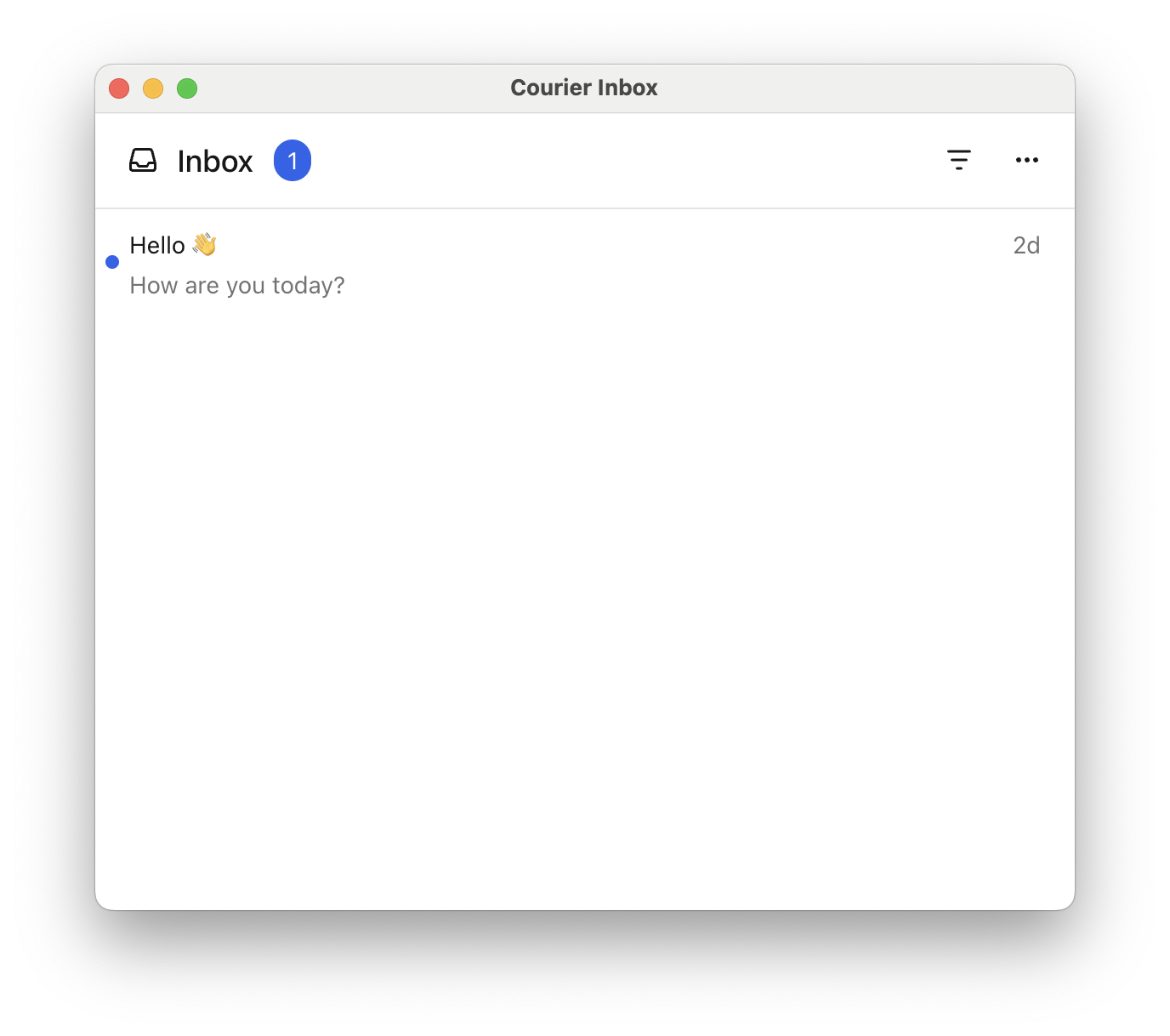
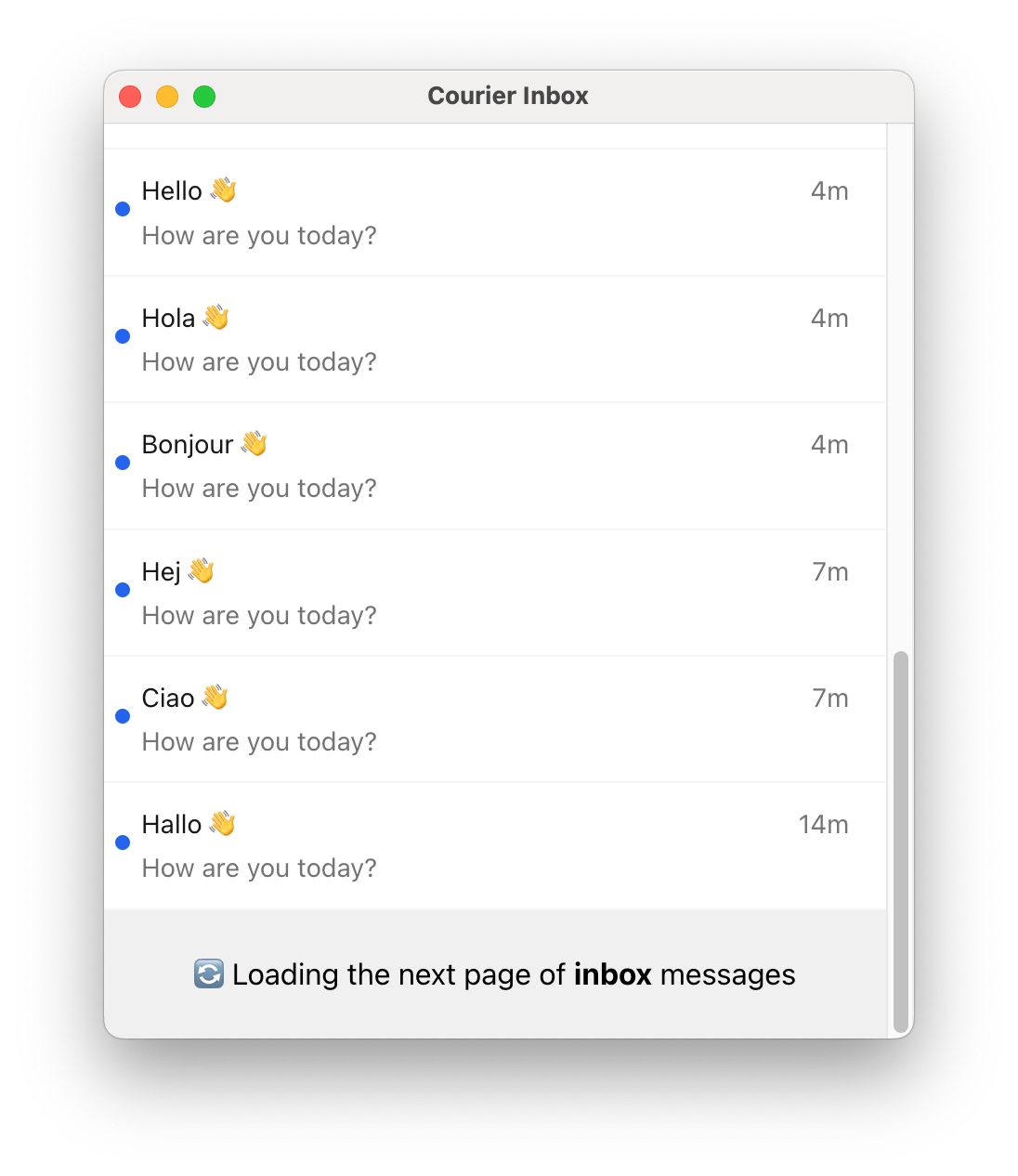
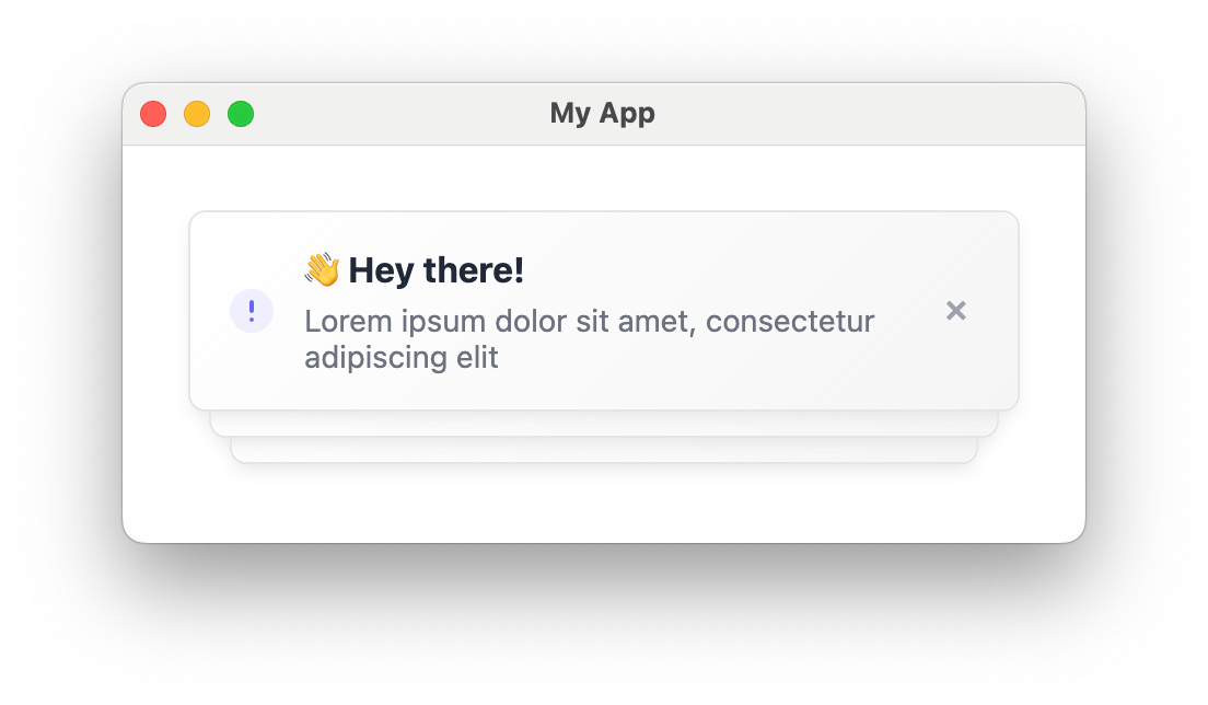
<CourierInbox /> has a default height of auto, meaning it will set its height based on its children.
Give the inbox a fixed height by setting the height prop.
Copy
Ask AI
import { CourierInbox } from "@trycourier/courier-react";export default function App() { // Courier authentication and other component code... return <CourierInbox height="50vh" />;}
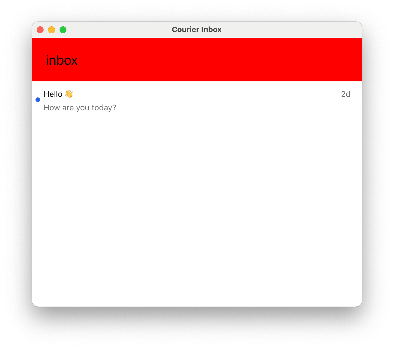
Customize the inbox loading, empty, error states and pagination item by passing a React component to the renderLoadingState, renderEmptyState, renderErrorState, and renderPaginationItem props.
Subsequent pages of messages are loaded automatically when the user scrolls to the bottom of the inbox,
so the pagination component may only be visible briefly.
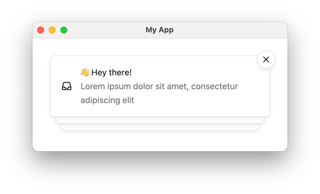
Toasts are short-lived notifications that notify users and prompt them to take action.
Courier’s Toast component is connected to the feed of Courier Inbox messages.
Toasts are synced with the Inbox message feed. You can use both components together to provide persistent and temporary notifications in your app. See the Inbox Component section above.
Add <CourierToast /> to your app and authenticate the user with the Courier backend:
Copy
Ask AI
import { useEffect } from "react";import { CourierToast, useCourier } from "@trycourier/courier-react";export default function App() { const courier = useCourier(); useEffect(() => { // Generate a JWT for your user on your backend server const jwt = "eyJhbGciOiJIUzI1NiIsInR5cCI6IkpXVCJ9..."; // Authenticate the user courier.shared.signIn({ userId: $YOUR_USER_ID, jwt: jwt, }); }, []); return <CourierToast />;}
Some initialization for toasts is asychronous. If your app displays toasts immediately when
the component is mounted, consider using the onReady to wait
until the <CourierToast> component is fully initialized.
Pass a callback function to the onToastItemClick prop to handle clicks on toast items.
Copy
Ask AI
import { useEffect } from "react";import { CourierToast, useCourier, type CourierToastItemClickEvent} from "@trycourier/courier-react";export default function App() { const courier = useCourier(); useEffect(() => { // Generate a JWT for your user on your backend server const jwt = "eyJhbGciOiJIUzI1NiIsInR5cCI6IkpXVCJ9..."; // Authenticate the user courier.shared.signIn({ userId, jwt }); }, []); return ( <CourierToast onToastItemClick={({ message }: CourierToastItemClickEvent) => { console.log("Toast clicked:", message); }}, /> );}
Show type CourierToastItemClickEvent
Copy
Ask AI
/** * Event metadata passed to the callback for onToastItemClick. */export type CourierToastItemClickEvent = { /** The message for the toast item that was clicked. */ message: InboxMessage; /** The toast item component clicked. */ toastItem: CourierToastItem | HTMLElement;};
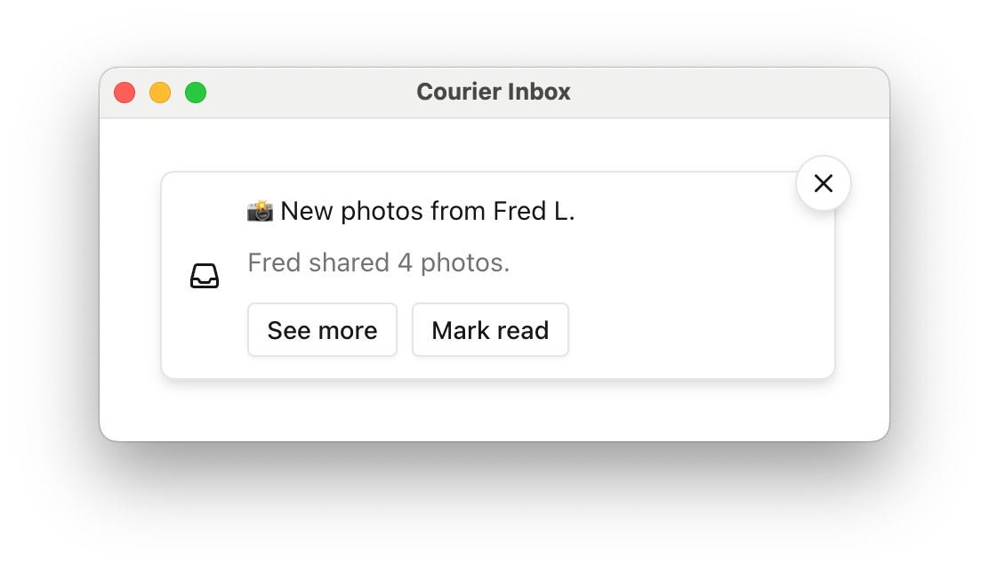
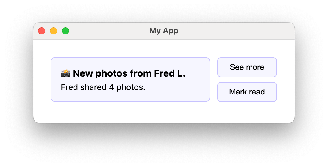
If a message contains actions, toast items
will include a button for each. By default, these buttons do not implement any functionality.Use onToastItemActionClick to handle clicks on action buttons within toast items.
Copy
Ask AI
import { useEffect } from "react";import { CourierToast, useCourier, type CourierToastItemActionClickEvent} from "@trycourier/courier-react";export default function App() { const courier = useCourier(); useEffect(() => { // Generate a JWT for your user on your backend server const jwt = "eyJhbGciOiJIUzI1NiIsInR5cCI6IkpXVCJ9..."; // Authenticate the user courier.shared.signIn({ userId, jwt }); }, []); return ( <CourierToast onToastItemActionClick={({ message, action }: CourierToastItemActionClickEvent) => { window.open(action.href); }} /> );}
Show type CourierToastItemActionClickEvent
Copy
Ask AI
/** * Event metadata passed to the callback for onToastItemActionClick. */export type CourierToastItemActionClickEvent = { /** The message for the toast item that was clicked. */ message: InboxMessage; /** The action for the action button that was clicked. */ action: InboxAction;}
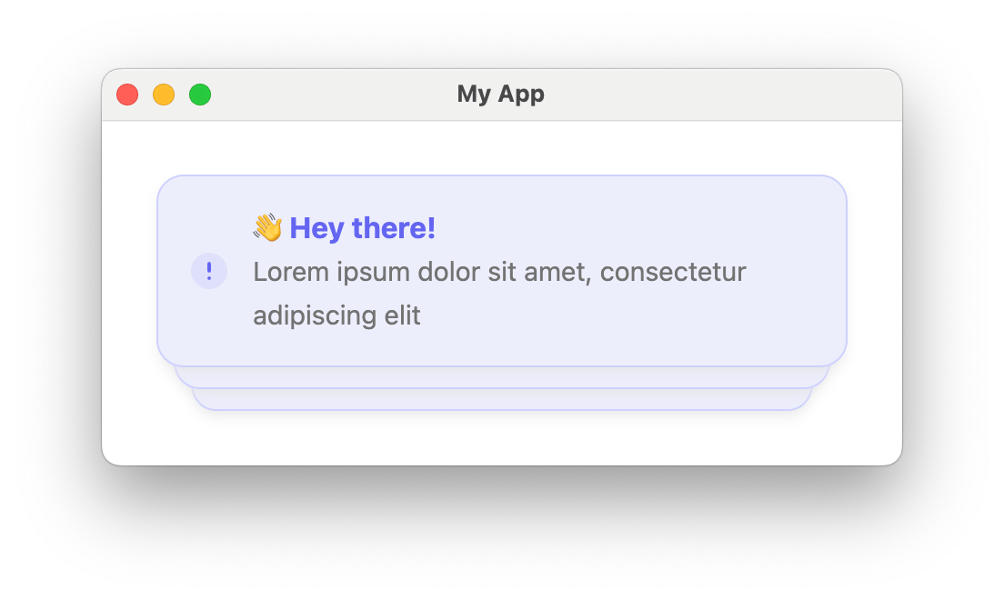
Customize only the content area of each toast item while reusing the default
stack structure and styling by passing a factory function to renderToastItemContent.The dismiss button and auto-dismiss functionality are still handled by the default toast item wrapper.
Customize each toast item’s appearance and behavior completely by passing a factory
function to renderToastItem. This gives you complete control over the toast item,
including its container, styling, and dismiss behavior.When using renderToastItem, the autoDismiss and autoDismissTimeoutMs props are still
respected, and toasts will be automatically removed after the timeout if autoDismiss is enabled.
/** * Props passed to custom render functions for toast items. */export type CourierToastItemFactoryProps = { /** The message for which the toast item is being created. */ message: InboxMessage; /** Whether the toast item will auto-dismiss. */ autoDismiss: boolean; /** The timeout before auto-dismissal in milliseconds. */ autoDismissTimeoutMs: number;};
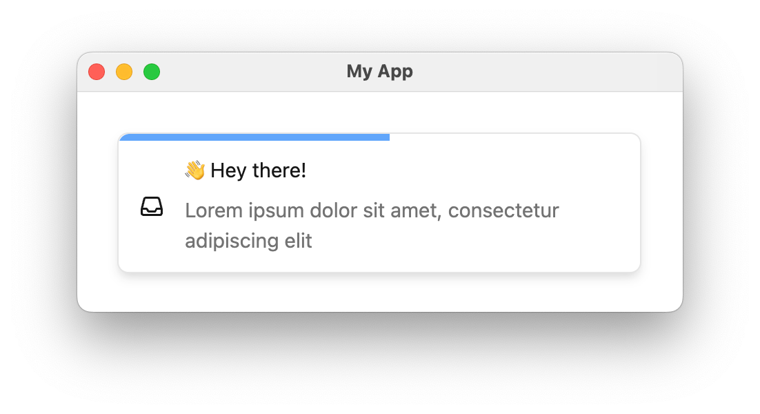
Use auto-dismissed toasts for non-critical notifications that don’t require immediate
action. For example, you might use an auto-dismissed toast to notify a user that a
scheduled task completed without issue.Auto-dismiss detailsEnabling auto-dismiss changes a few bits of toasts’ default behavior:
Toast items are automatically removed after the specified timeout.
A countdown bar appears at the top of each toast to indicate the
time remaining before dismissal. This countdown bar is theme-able via
the autoDismissBarColor value in CourierToastTheme.
The dismiss button (x) is only visible on hover, but you can customize
this behavior using the dismissButton prop.
Copy
Ask AI
import { CourierToast } from "@trycourier/courier-react";export default function App() { // Courier authentication and other component code... return ( <CourierToast autoDismiss={true} autoDismissTimeoutMs={7000} /> );}
The onReady callback is invoked when the CourierToast component has finished mounting and is ready to display messages.When to use onReadySome initialization for <CourierToast> is asychronous, such as syncing state between
React and the underlying Web Components. If you’re displaying toasts immediately on page load
(for example, with CourierToastDatastore)
or observing issues where toasts do not properly render custom content or click handlers, consider
using onReady to wait for <CourierToast> to fully initialize before acting.In the example below, onReady is used to toggle the toastReady state, passed
as a dependency to the React effect that performs authentication.
Copy
Ask AI
import { useEffect, useState } from "react";import { CourierToast, useCourier, type CourierToastItemFactoryProps} from "@trycourier/courier-react";const CustomToastItem = ({ message }: CourierToastItemFactoryProps) => ( <div style={{ padding: "16px", background: "#f3f4f6", borderRadius: "8px" }}> <strong>{message.title}</strong> </div>);export default function App() { const [toastReady, setToastReady] = useState(false); const courier = useCourier(); useEffect(() => { if (toastReady) { // Only authenticate after the toast is ready to ensure // custom render functions are applied const jwt = "eyJhbGciOiJIUzI1NiIsInR5cCI6IkpXVCJ9..."; courier.shared.signIn({ userId: $YOUR_USER_ID, jwt: jwt, }); } }, [toastReady, courier]); return ( <CourierToast onReady={setToastReady} renderToastItem={(props: CourierToastItemFactoryProps) => { return <CustomToastItem {...props} /> }} /> );}
Both Courier Inbox and Courier Toast support Next.js, however the components only support client side rendering.In Next.js version 13+, make sure to add the 'use client'
directive to the top of any file that uses Courier components.
Copy
Ask AI
"use client"import { CourierInbox } from "@trycourier/courier-react";export default function Page() { // Courier authentication and other component code... return <CourierInbox />;}